Integral Ad Science
Interactions
Much of my role involved leading our team to consider how users would interact with our interface. This entailed defining complex filtering to something as small as how an icon animates. This collection of interactions culminated in a system-wide language we developed. I sought to guide our team to create a thoughtful, unified language, that not only meets user expectations, but also provides a fluid platform experience.


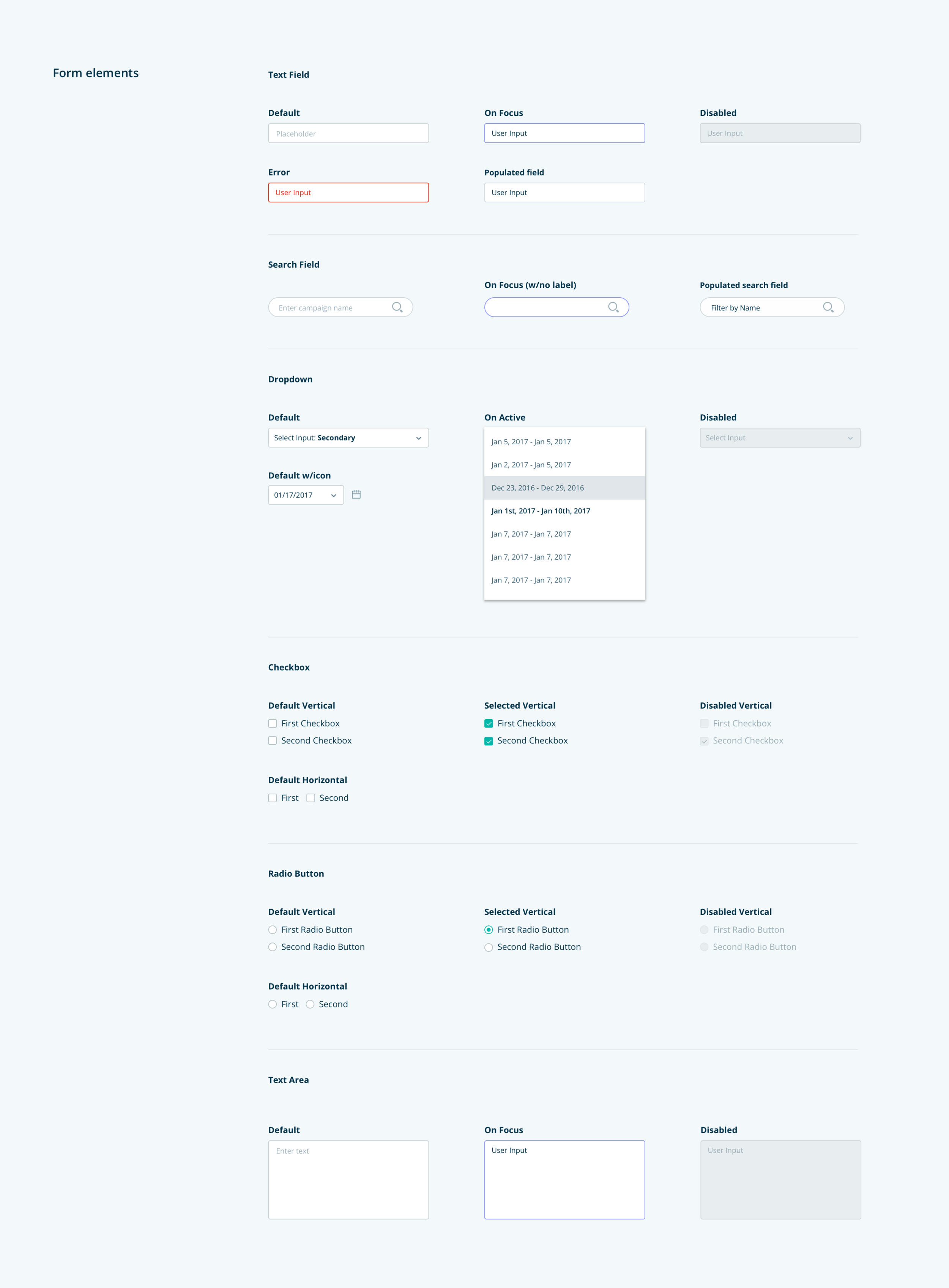
Component / Pattern Library
When I first joined the UX team at Integral Ad Science, I took time to speak to each of my colleagues about what their biggest blockers were in their day-to-day. Some mentioned navigating the complexity of the platform, others of the content itself, and how to tackle surfacing legacy reports in parallel to the newer platform. The one thing that I heard from most of my team members, however, was a need for a Pattern Library. Because of how our teams were comprised--each member owning a specific product vertical--they were often finding themselves recreating components and/or patterns from scratch, versus being able to leverage pre-existing work. This caused a disjointed experience for users, who would be exposed to varying interfaces, multiple variations of the same component, and different solutions for the same problems.

Why build a Pattern Library?
document and establish rules regarding the UI (factors in scalability)
ensure consistency across products (better, more fluid user experience)
reduce duplicating efforts across teams (reduces resources spent)
allow for rapid updates by engineers (makes maintenance easier)
The first step I took in identifying how deep the inconsistency problem was, entailed doing a site audit of components.
From there on I was able to make the case for unifying components, address what teams were responsible for which sections, and who would be able to assist the team and assume ownership.


Sandbox Pattern Library

Card Patterns

Page Templates
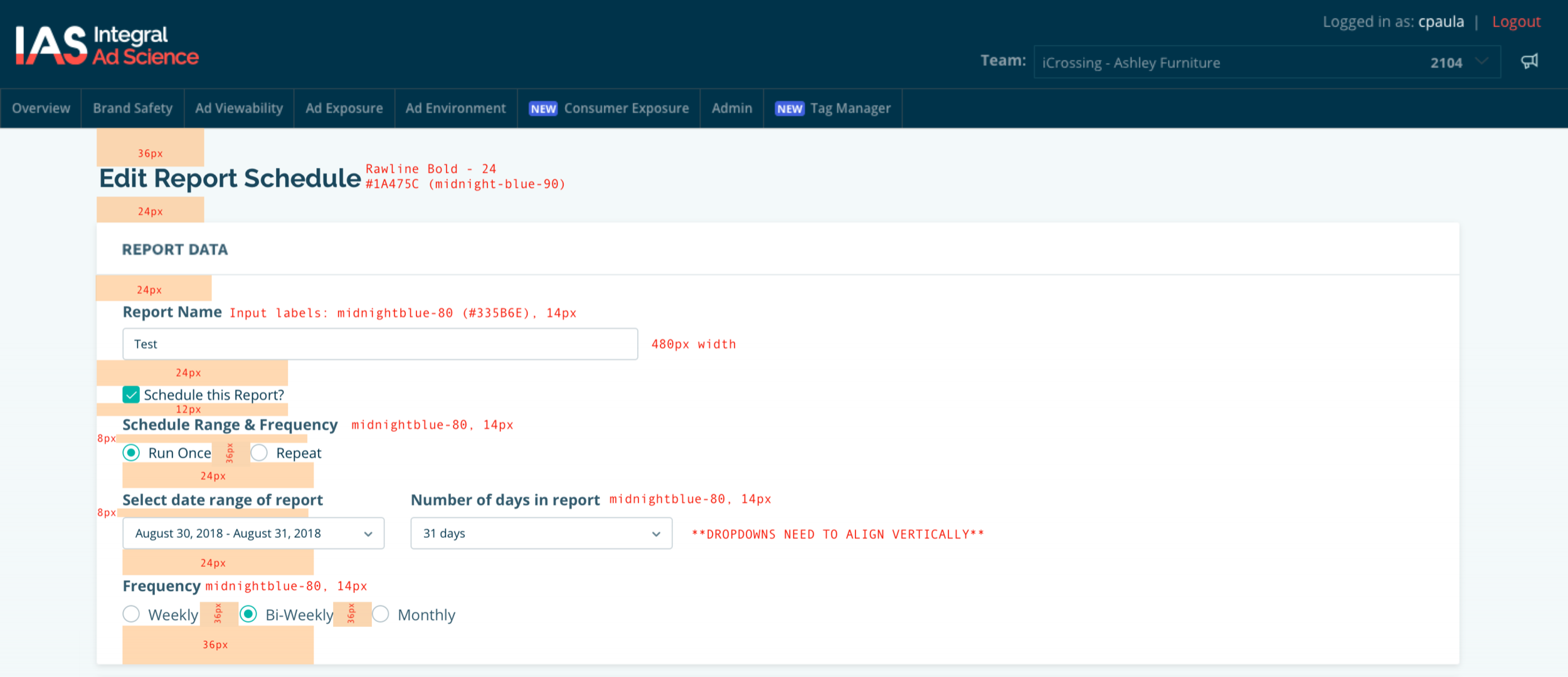
Visual Design QA
Working with team engineers, I was able to leverage the work they had already begun on a Sandbox Pattern Library. I also made it a priority to document & create symbols library within Sketch for cross-vertical UX team usage, basing our library model off of principles laid out by Atomic Design.
With cross-team collaboration, we begun building upon a strong foundation, slowly making progress in unifying assets, and ultimately giving our team and our users a better experience.
We had a few obstacles along the way, mainly in relation to versioning and not clearly prioritizing some items (grids, layout principles, accessibility guidelines, for example), but with each feature we learned how to improve the overall process. I believe we identified clear pain points & solved for repeating the same mistakes down the line.
Testing & Iterating
Our platform relied on the accessibility of complex data; IAS' Client Services team--which made up 80% of our users--must be able to easily navigate our UI in order to best serve client needs. Having such a large number of clients be internal was incredibly beneficial in terms of receiving quick feedback on design iterations. That being said, I would have liked to get to a point where our platform was so intuitive, it's entirely a self-service. Ideally, only 20% of our users would be internal, allowing our CS team to focus on quality of service, versus generating reports.
Discovery and exploration of our UI were critical to our team's mission.

Global Navigation Prototype

Customizable Report Builder

User test notes